Overview
Lumonus builds software used by radiation oncologists to manage cancer patient care, from reviewing clinical history through to treatment planning.
We released a new conversational AI feature which allows clinicians to ask questions about a patient. During testing, the feature received overwhelmingly positive feedback. However, after release its adoption quickly plateaued.
I worked across product discovery, design and frontend engineering to understand why adoption had stalled. I then led the implementation of a new interaction model that addressed the findings, improving the experience for clinicians while also strengthening the frontend architecture for future work.
Discovery
When adoption of the AI assistant fell short of expectations, we spoke to users to understand why. The feedback was overwhelmingly positive. They valued the quality of the responses, the depth of information and the accuracy of the assistant. So why were we seeing such limited uptake?
We found the answer when we observed clinicians using the application in practice. The AI lived on its own page - which meant that to use it, users had to leave whatever they were doing, ask their question, then navigate back to continue their original task. Several clinicians had developed their own workaround, opening the application in two browser tabs side by side, so they could keep the AI conversation visible while also viewing patient information.
Redesigning the workflow
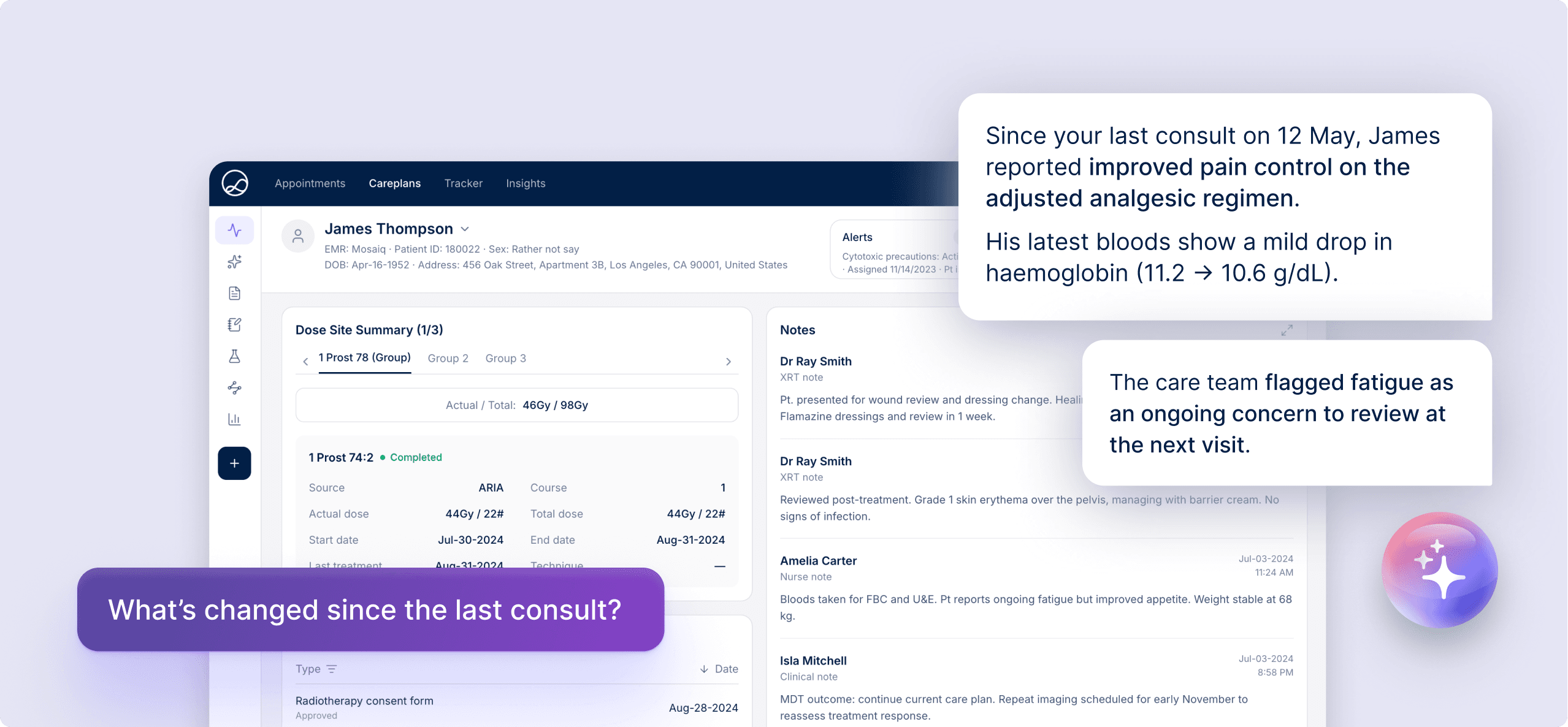
We designed a floating workspace that could be opened from anywhere in the application. Users could open it at any point, from any page. It displayed a persistent conversational panel while leaving the rest of the interface fully accessible.
The user interaction changed from sequential to parallel. Instead of moving between patient information and AI, clinicians could work with both simultaneously. The AI functionality didn't become more capable; it simply became available at the moment clinicians needed it.
Crafting intuitive interactions
Introducing a floating workspace changed how clinicians interacted with the application. The challenge wasn't just where the panel appeared - it was ensuring it behaved naturally and in a way users could rely on without having to think about it.
I paid close attention to the details that shaped those interactions. Example prompts encouraged exploration while quietly demonstrating the kinds of questions the assistant could answer, helping clinicians discover its capabilities through use rather than documentation. A keyboard shortcut opened the panel and focused the input field instantly so users could begin typing immediately. Keyboard accessibility, focus management, responsive behaviour and subtle animation all worked together to make the assistant feel natural, fast, responsive.
These decisions didn't change what the feature could do, but they substantially changed how it felt to use. That attention to frontend quality helped transform a functional interface into one that felt natural to use.
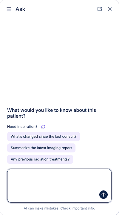
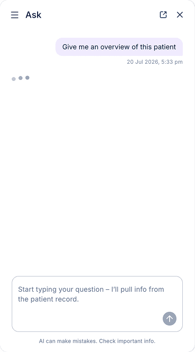
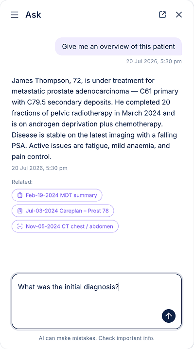
The panel provides example prompts to encourage interaction and 'explain without explaining' what the feature can do
Building reusable infrastructure
Because we were introducing a new UX pattern, I wanted the implementation to establish a reusable interaction pattern rather than a feature-specific component.
I implemented the floating workspace as extensible frontend infrastructure, keeping assumptions about its contents to a minimum so it could support capabilities beyond the initial use case. I treated the work as an opportunity to raise the frontend quality bar more broadly, establishing patterns for areas such as motion and interaction and walking the development team through the thinking behind them. The result was frontend work that created leverage beyond the feature itself, giving the wider team stronger patterns to build from.
This proved valuable a few months later; a long-standing complaint we had from users that note-taking was too fiddly (it lived several levels deep in the application) was resolved by moving it to the same floating workspace. Another developer was able to implement the Notes feature quickly and easily; the architecture had already been established, and they had a working knowledge of how to use it from the walkthroughs. Clinicians could now capture notes while continuing to review patient information, and development had taken less time than expected.
Outcome
The project addressed the original adoption problem while also increasing the visibility of the feature itself. Alongside improved usage from existing users, we also saw clinicians begin using the feature who previously hadn't engaged with it at all.
Additionally, the project established a reusable interaction model that continued to influence the product beyond the release of this feature. What began as a solution for AI became shared infrastructure that other capabilities could adopt, reducing future implementation effort while creating a more consistent experience across the application.
Reflection
It can be difficult to make the case for revisiting an existing capability when there's constant pressure to build something new. Building the original AI assistant had already been a substantial piece of work, and it would have been easy to consider it finished when it shipped. By focusing on adoption rather than functionality, we unlocked significant value for users without adding a single new AI capability, allowing the original investment in the AI to finally deliver on its potential.
Shipping the feature isn't the end of the design process. The most valuable improvements come from understanding how people actually work, and refining the experience until the software works for them.